Saturday, March 5, 2011

My Power Weapons: step by step


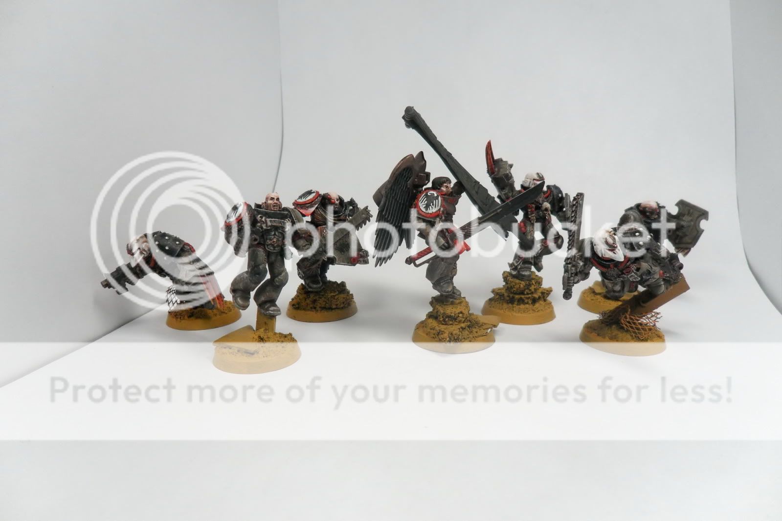
I had these photos from the day I did the jump pack tutorial, so I figured I would turn it into a quick step by step of what I do for my power weapons. Click the picture for a larger view.


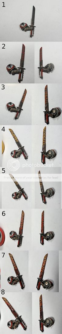
  1. Black base coat weapon. I prefer to finish everything else, and leave the power effect for last.

  2. P3 Khador Red thinned down and applied by painting little droplets, think like a slow tattoo gun motion. This means you need to keep the paint watered down and not very much on your brush. I try to make larger black sections by the base and back of the blade, and get smaller as I get closer to the business end.

  3. 50/50 mix of P3 Red and Vallejo Sun Yellow. Same approach as step 2, but trying to get a thinner line.

  4. Repeated again with straight yellow. I went a little heavy handed on the left, and it will show by the end.

  5. Touch up the lave flakes with black, thin the lines down to make them look more like cracks. You can see again the right is looking better than the left.

  6. Apply a layer of P3 Red Ink to the blade side, and quickly remove it from the tip and along the front of the blade (I use my thumb to completely remove it from the very edges, and then slightly from the nearby area) to make a quick gradient. If you want more red intensity you can repeat this step a few times, applying to less and less of the blade towards the base. You may want to go back with a black wash to darken the black parts if you do this.

  7. When everything is dried, reapply some yellow in spots where multiple lines meet, and try to trace it down the length of the sword towards the little power node thing. Take some white and hit a few of the line intersections sparingly.

  8. Apply a leviathan purple to the bottom half of the blade, and wipe away the top part again for a darkened gradient at the hilt. Repeat as necessary. You can see it hadn't quite dried when I took the pictures, but the end result is a dulling down.

There you have it, pretty straight forward. Its not better than layering 20 times, but it is certainly faster. If you don't like the gradient, you can just leave it at step 5.

From these last two tutorials, I have grown into a technique of inks and washes for lighting effects that has worked fairly well for my tastes. Inks intensify and saturate, and washes to dull and shade. I have some more inks on the way, so expect a few variants on this method for my lighting effects in future projects.

Thursday, March 3, 2011

Jump Pack Thrusters - Light em up!

No longer must your jump packs be extinguished! light em up! Here is a step by step of how I make mine (shamelessly copy&pasted from my BnC post..)

I use P3 red ink, and Vallejo sun yellow and white.

I start with basic black primed or dark dry-brushed jump pack thrusters. I work on them in sets so I can maximize painting while others dry.


I start with a big blob of white in the two source parts of each thruster. I often have a huge crack there, so I will add thick white layers over the course of painting to fill it up. These will be my light source. I then take thinned whites and edge all the hard corners and lines that would face these white light sources. This needs a brush with a well kept point, but uses the paint on the edge of the brush. If you are not used to this method, take some scrap minis to try it on. Having the right amount of thinned paint on the brush will help immensely, so I usually wipe the first stroke on my thumbnail (subsequently I often end a paint session with a Jackson Pollock on my thumb)


Next I do the same thing with a thinned Sunburst Yellow, leaving white at the source dots. Well thinned paint helps again. Too watery and it will run into crevices, and too dry and you will be dry-brushing a yellow that isn't as striking.


I cover everything in a thin layer of red ink, leave the white sources if you can, otherwise touch it up at the end. This gives everything a good heated area look.


I go back over some of the edges with yellow again.


I decided the red wasn't heavy enough, so I apply another red ink layer to certain spots away from the edges and touch up the white sources.


There you go! This is a good way to get used to simple source lighting. You can see that my powerfist/thunderhammers follow a similar lighting feel. My other power weapons follow a slightly different style, relying more on lava texture and gradient.
______________________________________________

Wednesday, March 2, 2011

Vanguard at the Ready!


Vanguard Veterans and Priest are nearing completion. Still missing jumppacks and some detailing before they are complete, but soon! I hope to finish this stuff this weekend, as I have a secret project that has crept up on me...

I will do what I can to shield you from the unknowable horror with which it holds, but I fear I will ultimately fail in such a task..


______________________________________________